LOGOFOLIO
DESIGNSBY VIJAY
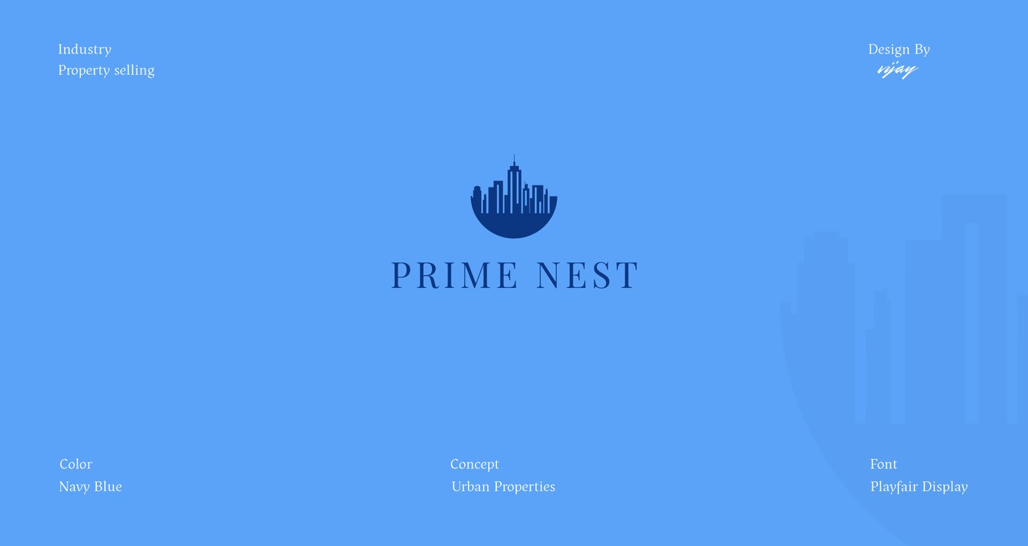


Logo Designs
Creative Logo Design Works
My Style of Design
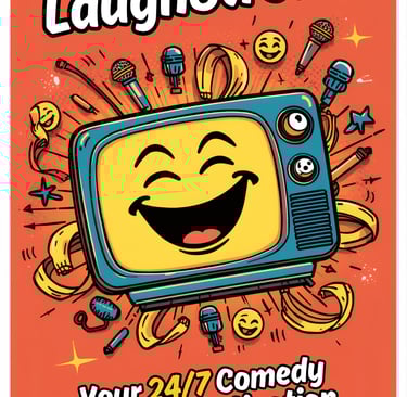
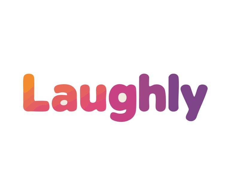
Brainstorm: "The client is launching an OTT platform solely for comedy. This is a crowded space (Netflix, Prime, etc.), so 'Laughly' must scream 'FUN' instantly, but also 'STREAMING.' The name 'Laughly' is great—it's active and suggests a service dedicated to laughing. The logo must bridge the gap between digital content and physical emotion. For comedy, key emotional attributes are: Joy, Surprise, Energy, Inclusivity, and Relief. For OTT, the attributes are: Playback, Access, Movement, and Technology.
Developing the Visuals
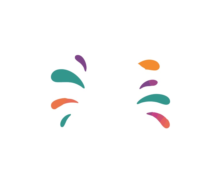
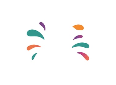
Now, let’s refine the elements. The play button is a staple. If it sits above the smile, it forms a face. What about the laughter itself? It can’t just be a static line. It needs to burst outwards. The splash elements must look like uncontrolled joy, like water or sound waves. To make it modern and globally appealing, we need gradients. Single flat colors will feel old. Gradients allow for a dynamic, multi-dimensional feel.
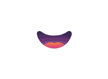
The Idea: "Let's create a visual metaphor where the physical act of laughter is the media content itself. The play button should be the eyes and the brain; the smile is the resulting physical response. This forms a 'Laughing Face' that is also a 'Player Interface.'"
Step-by-Step Execution:
Icon: Position the rounded-triangle play button centrally..


Smile: Design a stylized, symmetrical curved smile shape. Crucially, the smile must be hollow to create a visual loop or 'stomach' for laughter (or content) to sit in.

Splash: Fan out small, asymmetric droplet shapes around the play button.
Typography: Choose a bold, rounded sans-serif. It needs substance. To make it friendly, every corner should be softened..
Color Application: Now
Start the play button (the 'input') with a cool orange-to-pink gradient (warm and inviting).
Transition the smile (the 'output') from pink to a cool, deep purple (depth, night-mode appropriate).
Make the splashes diverse (teal, purple, green) to represent the all languages and global variety of the content.
The Finished Design: This resulting design is a hybrid face-icon.
Central Idea: The central face is formed by the play button and smile.
Narrative: It tells a story: The play button activates, and the smile and splashes are the resulting eruption of laughter.
Meaning: The splashes symbolize the multi-lingual, diverse nature of global comedy content (the 'variety show' aspect).
Typeface: The "Laughly" wordmark mirrors the gradients and rounded nature of the icon for perfect cohesion.
Conclusion: "The Laughly design succeeded because it found the most direct and joyful metaphor possible. By merging the interface with the emotion, the logo becomes not just a mark, but a friendly character that welcomes users into a world of laughter."


Logo Branding
Logo Design - Restaurant
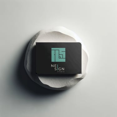
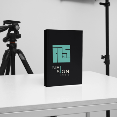
Logo Design - Studio